American Water Branding Case Study
Project Description
American Water Branding Case Study
American Water delivers water service to 16 million people in 35 states and two Canadian provinces every day. However, at the time, the utility’s name was only known by about half its customers. This American Water branding case study describes how we elevated the American Water brand. We were able to distinguish the company and at the same time built public interest. This positioned the company favorably for their IPO launch on Wall Street.
OUR CREATIVE APPROACH
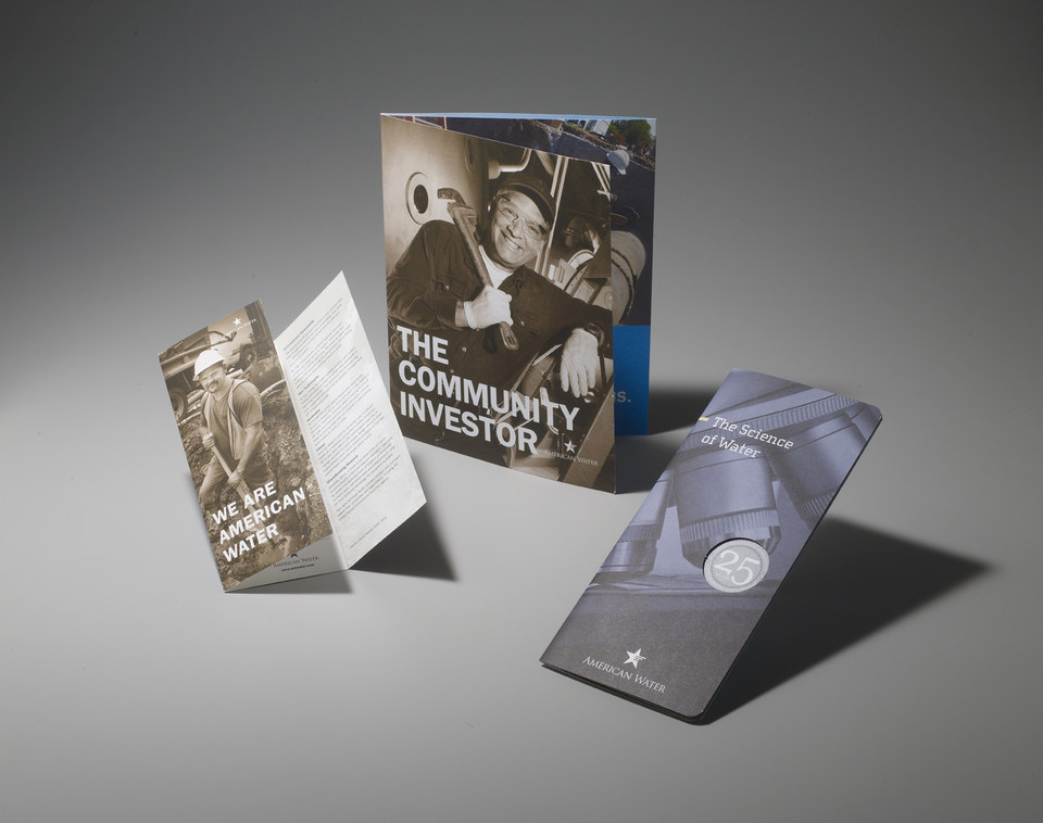
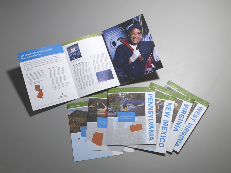
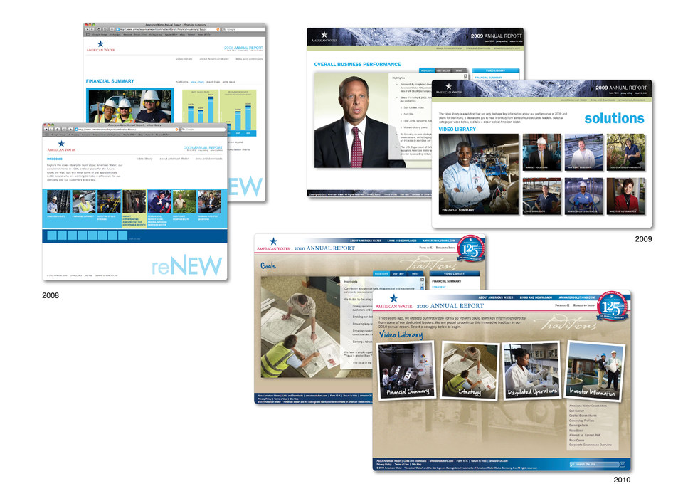
Our creative strategy began with changing the company’s photography. Instead of using water source images (rivers and streams), we photographed American Water employees across the country. Using these dynamic new images shifted the company into more conversational and engaging visuals. We also integrated bold and memorable statements that were emphasized using powerful type and a unique color palette. Sepia-toned and full-color images were used with a signature bright blue to draw interest.
Project Details
Category
Branding
For
American Water
Type
Corporate and subsidiaries identity, brochures/collateral, direct marketing, website, interactive annual reports