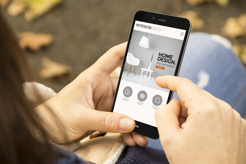
Four Ways to Make Your Landing Pages Work Harder
When you put a landing page online, your goal is results. Not a slick brand image or cool functionality, but as many leads or orders as you can possibly handle. So here are four no-holds-barred tips to squeeze more visitor conversions from your landing pages. These principles are standard practice for ecommerce pros worldwide. Use them to grow your numbers and bring in more business.
1. Eliminate extra links. It’s natural to treat landing pages as part of your website by including site navigation and social media links. But Hubspot tests indicate that pages without extra links are up to 28% more effective, while other studies say they lift conversions by 90% or even 100%. If the only way off your page is by clicking the call to action, it’s natural that more people will enter your sales funnel instead of browsing aimlessly.
2. Make only one offer. Many landing pages use multiple offers, hoping for the widest possible appeal. Frequently cited studies, however, say single-offer pages can be up to 266% more effective. Most visitors stay on a page for eight seconds or less, so asking them to evaluate multiple offers will lead to indecision rather than action. Typically, it’s better to spotlight one offer and test spin-off pages until you settle on what works best.
3. Stick out like a sore thumb. A subtle call to action tastefully nestled at the bottom of your page won’t grab visitors in their brief moment on your page. So make the call to action highly visible. Turn your text link into a big button, give it a strongly contrasting color and position it near high-visibility elements such as a headline, graphic, arrow or callout. Place it near the top of the page or even make it part of a sticky header. This is especially helpful for visitors scrolling through your page on small-screen mobile devices, who will make about three-quarters of all ecommerce purchases by 2021.
4. Ask fewer questions. For most marketers, an email address is the one essential piece of prospect information. Yet many online reply forms are obstacle courses, expecting prospects to patiently complete a dozen fields or more. Forms with 3-5 fields get the best conversion rates, so keep it simple and get them into the pipeline. You might also steer clear of questions about age and other demographics, which depress conversion rates.
If generating leads or boosting online engagement is your challenge, Creative Co-op has the ideas and real-world experience to help. Just contact us today at (603) 658-1600.
LINKS
https://blog.hubspot.com/marketing/landing-page-navigation-ht
http://www.interactivemarketinginc.com/landing-pages.html
https://www.statista.com/chart/13139/estimated-worldwide-mobile-e-commerce-sales/
https://www.crazyegg.com/blog/high-converting-cta-buttons/
https://unbounce.com/conversion-rate-optimization/how-to-optimize-contact-forms/