Five Features of a Mobile Friendly Site
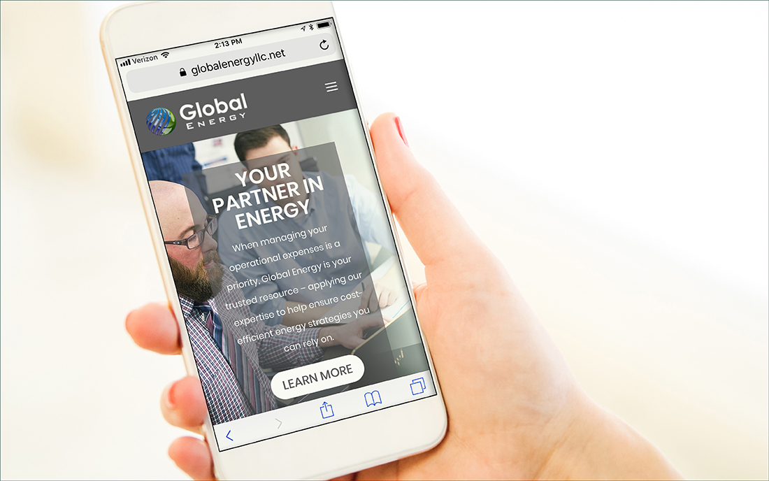
With all the devices people carry, it’s hard to be certain that mobile consumers are seeing your website favorably on their diminutive screens. So how can you tell?
Google has a handy mobile test page that offers an instant thumbs-up or thumbs down, even simulating how your homepage looks on a smartphone screen. But if you’re still uncertain, these five attributes can help illustrate some of the basic principles that make a site mobile-friendly.
1. Easy Navigation
If impatient mobile visitors can’t access key functions directly from your homepage or landing page, you’ll suffer from high drop-off rates. Remedy: add a vertical list of shortcut buttons or an icon-driven grid so visitors can shop, compare, buy, download or demo right away.
2. Scroll-free Content
Smartphone users want a navigable snapshot about the size of a business card. If you feature sprawling text and imagery that require endless scrolling, your site is probably seen as an annoying time-waster. Remedy: compartmentalize everything with tabbed or collapsible content and image sliders, so the big picture is always in view.
3. Big Touch Targets
Are you frustrating touchscreen tappers with tiny buttons they can’t lay a finger on? Remedy: follow the lead of smart interface designers like Apple and upsize touch targets such as buttons or icons, so the first easy tap on their touchscreen takes them precisely where they want to go,
4. Instant Help Options
If you don’t have click-to-call, click-to-text or online chat buttons clearly featured, you’re missing the chance to answer questions, make sales and build loyalty. Remedy: Put one-touch contact options on your homepage and “Contact us” page. These users have phones in their hands, so they’re ready to engage.
5. Videos
96% of consumers find videos helpful when making buying decisions online, and mobile users find them especially valuable because they pack a lot of information within a small space. Remedy: Place a short, 1- or 2-minute video about your company or product in a high-traffic area of your site. Studies show that videos can increase conversions by nearly 13% on average.
To make certain that your own website is at everyone’s fingertips, contact Creative Co-op today at (603) 658-1600. We can help you tap into today’s vast pool of mobile consumers.
LINKS